
Center for Problem-Oriented Policing
Step 57: Use simple figures
Like tables and maps, figures and charts are effective tools for conveying information, but only if they are kept simple. All figures consist of two parts packaging and content. Content is the information you are interested in conveying to others. The purpose of the packaging is to ensure that the content can be quickly, easily, and accurately interpreted. Simplicity means keeping the packaging to a minimum. The most common mistake is adding elements that get in the way of the story. To illustrate this, we begin with an example of a poorly designed figure. Then we will show how figures become clearer and more powerful by making them simpler.
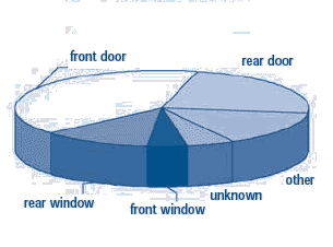
Figure 1 is a pie chart that is supposed to show how burglars entered homes. The 3-D image distorts the message. As we will see later, doors are the biggest problem, and the rear window ranks fourth, behind "other," as the entry of choice for these burglars. The 3-D effect inflates the importance of the slices in the front (in this example, front windows, the least likely point of entry) while deflating the importance of the slices in the back. The single valuable feature of a pie chart is that it shows how the parts contribute to the whole. This is lost when a 3-D effect is used. Note that a variety of shades and patterns need to be used to display the six categories. This adds clutter.
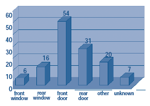
Figure 2 shows the distortion that 3-D effects can produce in bar charts. Comparing bar heights is difficult because one has to choose between the front top edge and the back top edge of the bar. 3-D effects should never be used.
Figure 1: Methods of Entry
This chart has a number of other features that make it hard to use: surface shading that masks contrasts between the bars and background, redundant bar labels and vertical axis labels, and distracting horizontal lines. The frame around the figure is superfluous.
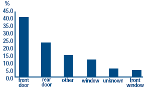
The simple bar chart in Figure 3 communicates information very effectively because all the confusing features of Figure 2 have been removed. If we wanted each bar to show the exact percentage, we could label the tops of the bars. But then we should remove the vertical axis, as this feature communicates the same information.
Additionally, the data in Figure 3 have been reorganized. Instead of raw numbers of burglaries, the chart shows the percentage of the total. This communicates two points: which methods are more frequent, and what part of the whole each method represents. If you need to show the relative contribution to a whole, use percentages in a bar chart rather than a pie chart.
Another feature of Figure 3 is that the categories are arranged in a meaningful order: from most to least. This points to where your readers should focus their attention. Meaningful order is hard to communicate in a pie chart because it has no obvious beginning or end. There really is no need to use a pie chart because bar charts can communicate better. When you have data in categories, bar charts are simple and effective.
Figure 2: Methods of Entry
Do not forget the figure title. In Figure 3 the title boldly tells a story. Not only is this far more interesting than "Methods of Entry," it makes the story unambiguous. In short, Figure 3 can stand by itself. Without reading any accompanying text, the reader gets the point.
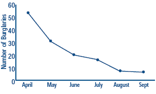
The final figure depicts a line graph. These are typically used when tracking data over time. In Figure 4, the data cover 6 months. The dots symbolize the burglary count, and the lines indicate a continuous connection over time. You should label the vertical axis so the figure communicates the story on its own. In this figure, we know at a glance that the vertical axis shows the number of burglaries, rather than the burglary rate.
Figure 3: Doors are the Problem
If you prefer to show the number of events at each time period, label the dots, but remove the vertical axis: it's now redundant. Be careful, however. Numerical labels at every time point can make a chart difficult to read. If multiple graphs are shown in the same figure (for example, the trend in burglaries for several police districts), make sure the different lines are clearly marked and easily differentiated over the chart.
Figure 4: Burglary is Declining
Designing Effective Figures
- Keep them simple. Don't over-package.
- Do not use superficial effects, like 3-D.
- Avoid pie charts.
- Use bar charts for data that comes in categories.
- Use line graphs for trends over time.
- Use labels effectively.
- Choose titles carefully.
- Make them stand on their own, without help from the text.